Margo Dunlap
is a UX researcher, design strategist, & intermittent designer/maker.

For the past five years I have been a design strategist at a consultancy in Boston where all of my projects are under NDA, so what you see on this website is a limited view of the work I do.
I received my MFA in 2016 from Art Center College of Design’s Media Design Practices program. Before graduate school I worked on green infrastructure (green roofs, street-level rain capture), studied human geography at Dartmouth, and spent 18 years in rural Vermont.
This site was lovingly hand-coded by me, and is set in Adelle and Adelle Sans. You can email me at ![]() , follow me on
, follow me on ![]() twitter or
twitter or ![]() instagram, or download my resume.
instagram, or download my resume.
National Park Service
rebranding & signage, 2015


history & aesthetic branding

The US National Park Service brochures, with their strong black frame across the top and the unigrid layout inside, were designed by Massimo Vignelli in 1977. Vignelli's work for the NPS is something of a gold standard in design history and the brochures are a casual collectable for national park enthusiasts.
I particularly like the black blocking motif for the way it frames and centers the product, which is the landscape itself. The National Park Service's recent rebrand is below, done for the centennial.

The campagin's simplified graphics, brighter colors, and tagline, 'find your park', seem to be aiming for a local and friendly vibe, probably to increase attendance at smaller parks. I think this is an error, however. The US national parks represent one of the most ambitious public works and environmental conservation programs in world history, and some of the most (accessible) epic landscapes. Minimizing them is a waste.
That said, these lands came to the American public at the expense of Native Americans. My primary design objective for this exercise was to step away from the sort of aesthetics empitomized by the sign below. Not only is this type of racist caricaturization and aestheticization both cruel and terribly gauche in light of the history of the NPS, but the country is changing. At this cultural moment it's just bad branding practice.

solution
old ➳ new


signage

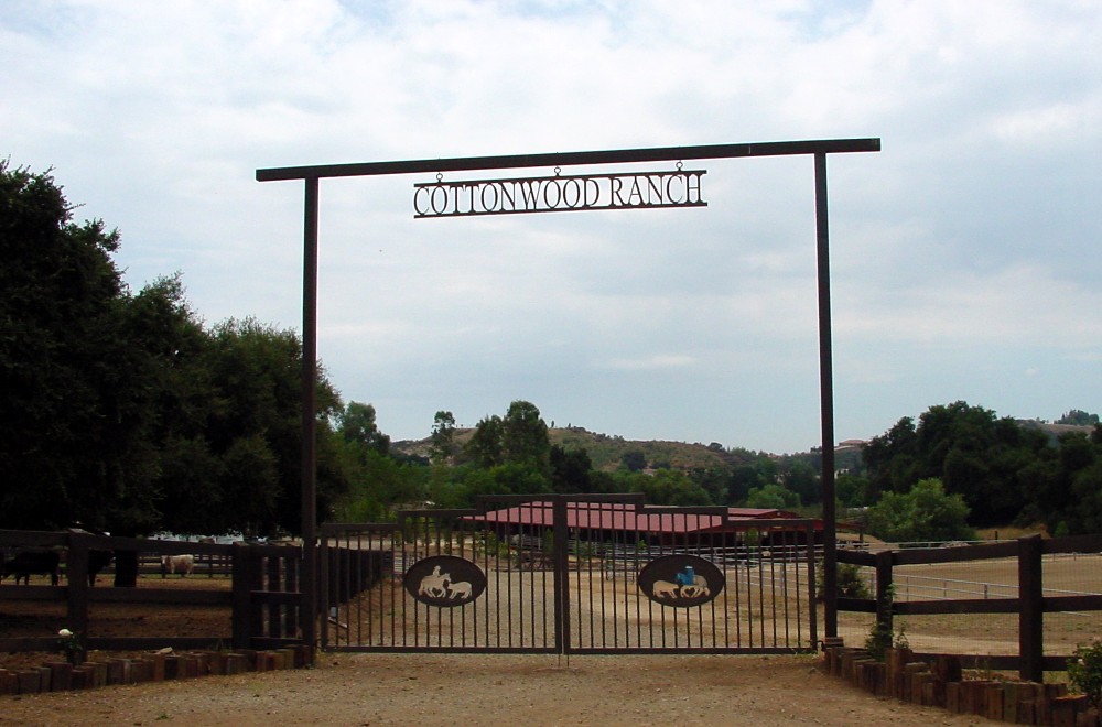
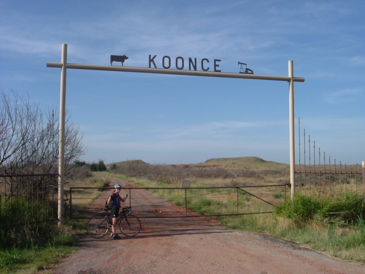
This form comes from the Vignelli work, but it is also an architectural homage to a vernacular design style of ranch gates common to the American West. The photos below are collected from google images.
A Texan acquaintance told me these gates are a bit old-fashioned, and often found on the really big ranches. 'A little point of entry that you know leads to something spectacular.'