Margo Dunlap
is a UX researcher, design strategist, & intermittent designer/maker.

For the past five years I have been a design strategist at a consultancy in Boston where all of my projects are under NDA, so what you see on this website is a limited view of the work I do.
I received my MFA in 2016 from Art Center College of Design’s Media Design Practices program. Before graduate school I worked on green infrastructure (green roofs, street-level rain capture), studied human geography at Dartmouth, and spent 18 years in rural Vermont.
This site was lovingly hand-coded by me, and is set in Adelle and Adelle Sans. You can email me at ![]() , follow me on
, follow me on ![]() twitter or
twitter or ![]() instagram, or download my resume.
instagram, or download my resume.

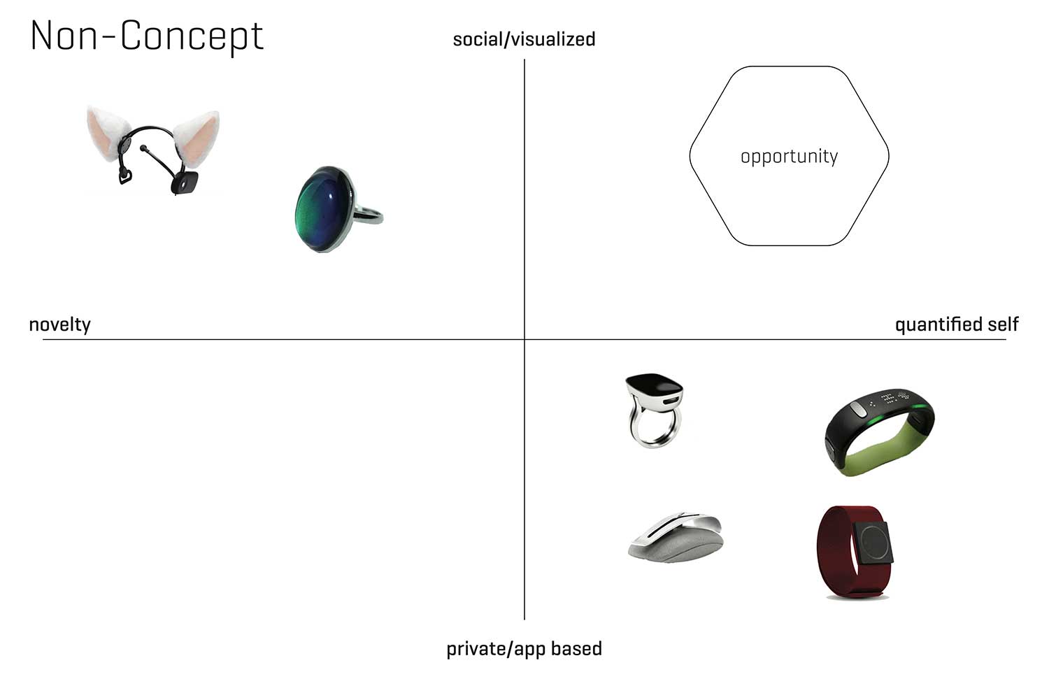
AURA CONCEPT WEARABLE
social mood tracking for emotional health, 2015
Aura was a concept project to design a product and its digital interface, touching on user research, persona and scenario development, market strategy, formal product design, system architecture, wireframing, and user interface design.
The product is a biometrics-based wearable that tracks and applies mood data to interpersonal relationships and vice versa. The system displays visualizations of this information via OLED screen jewelry. In spirit, its a high tech mood ring.

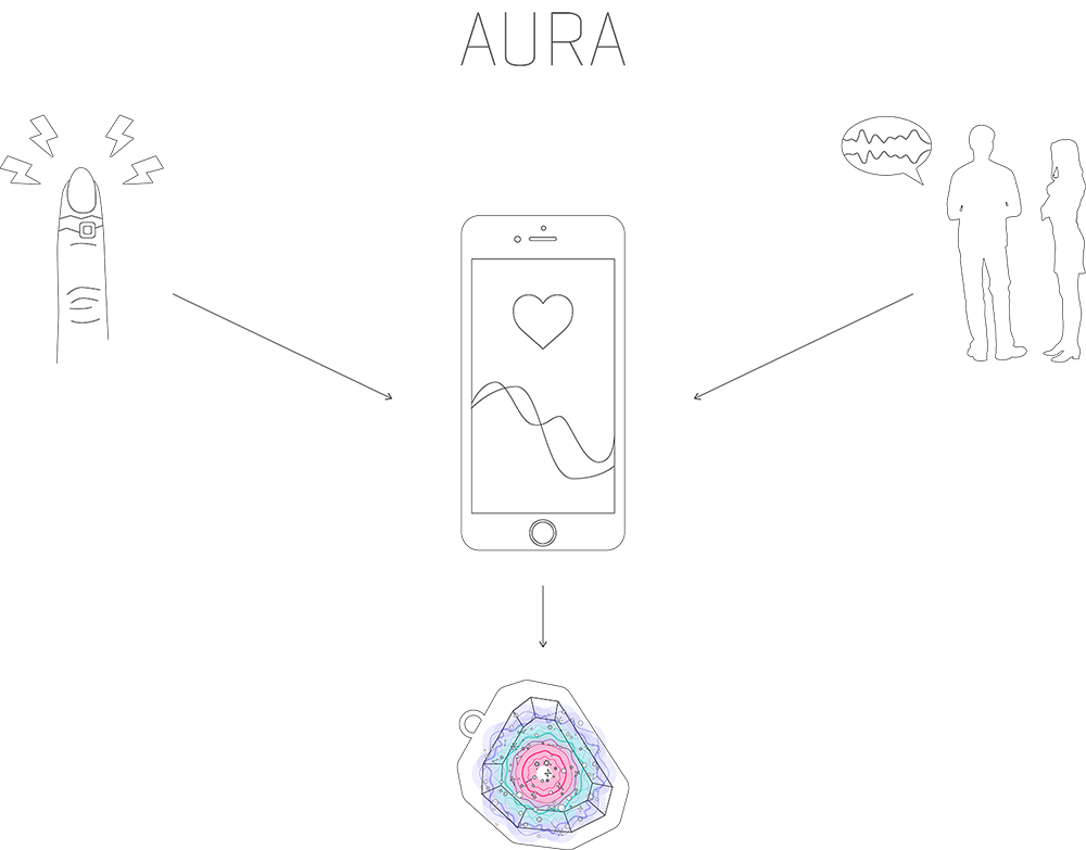
system diagram
Aura's top-level components are the LED jewelry, a smartphone app, and an optional stick-on finger-based sensor. Through the smartphone's microphone, the system listens for mood indicators such as tonal stress or laughter.
The stick-on circuit senses electrodermal activity, a physiological stress and excitement indicator. The app occasionally prompts for manual confirmation of mood status. All this raw data is aggregated and then visualized on the jewelry.

I spent several hours trying to untangle this in mind-mapping software, but this tiered version was the arrangement that communicated best.
The technology in this project is near-future - between five and ten years, realistically, for the OLED screens (which can take the beveled gem shape) and the skin-based sensor circuit.

experience goals


UI flowchart

⇩ gestures start here


Interface Style Guide

product (the gems)
The idea here was that a user could feed different visualizations to differently sized and housed gems - so you might have one displaying your mood and another showing your partner's. The cases play with different materialities and engraving.
I tried to design a piece of technology that could be precious, not because it's expensive in the way an iphone is precious, but because it's beautiful and meaningful.
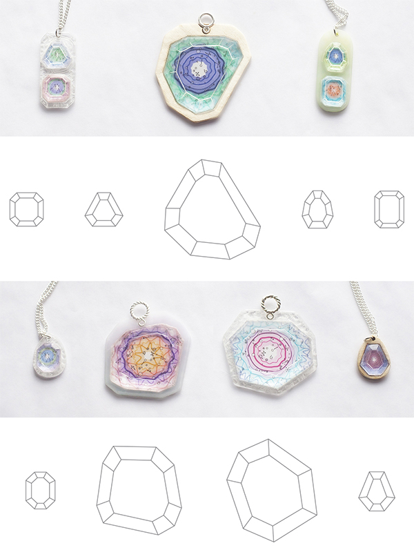
This is a humble placeholder composite until I am able to shoot the dozens of formal iterations. I did almost all of the prototyping on the lasercutter, including the final pieces, which were then hand-polished to achieve a bevel.
The hinged and engraved versions came out of researching the history of jewelry and pocketwatch design, per the criteria of designing for long-term value. This composite also shows some of the evolution of the data visualization.


data visualization (the mood constellation)
It was important to me that the app include a traditional data visualization (a graph) for viewing the mood data as well as the abstract version. That said, the data constellation is intended to be something a user would quickly learn to interpret.
New data appears in the center and fades outwards so that a glance can give you immediate history of the past few hours as well as a snapshot of the whole week, for example.

Icons
Doodles. I clearly struggle with the angles on lightning bolts.